Custom Sportswear Color Guide

How to choose, communicate and confirm colors for custom sublimated sportswear.

Custom sportswear color guide by Vimost Sports

Color is an important part of every custom sportswear design. Team colors, brand colors, sponsor logos and full sublimation artwork all need clear color communication before production. This guide helps customers understand how to provide color references and what to expect when colors move from screen to fabric.

Why Color References Matter

In custom sportswear, color is not only a visual detail. It represents a team, club, brand or sponsor identity. A small color difference can make a jersey feel different from the approved design or brand standard.

Clear color references help reduce misunderstanding during artwork preparation, sublimation printing and production. The more accurate the color information you provide, the easier it is for our team to prepare a design that matches your expectations.

  • Team colors
  • Brand colors
  • Sponsor logo colors
  • Home and away uniform colors
  • Previous sample or old jersey colors
  • Pantone, CMYK, RGB or HEX references

Screen Colors vs Printed Fabric Colors

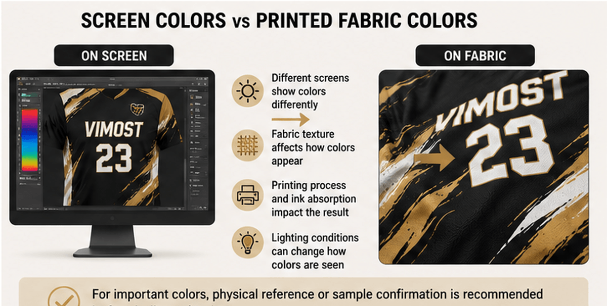
Colors shown on a computer screen, phone or tablet are only digital references. They may look different depending on screen brightness, display settings, device type and lighting conditions.

Printed colors on fabric can also appear different from the digital artwork because fabric texture, base color, fiber content, ink absorption and heat transfer can all affect the final result. For this reason, screen colors should not be treated as the final production color standard.

  • A color on screen may not look exactly the same on fabric.
  • Different monitors and phones can show the same color differently.
  • Fabric texture and material can change how colors appear.
  • Lighting conditions can affect how printed colors are seen.
  • For important colors, physical reference or sample confirmation is recommended.
Screen color and printed fabric color difference for custom sportswear

Pantone, CMYK, RGB and HEX Explained

Customers may provide colors in different formats. Each color system has a different purpose, so it is helpful to understand how they are used in custom sportswear artwork and production.

Pantone

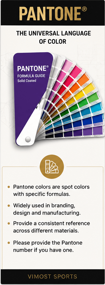
pantone color reference custom sportswear

Pantone is often used as a color reference system for brands, designers and manufacturers. If your team or brand has a Pantone color, please provide the Pantone number when preparing your custom sportswear design.

CMYK

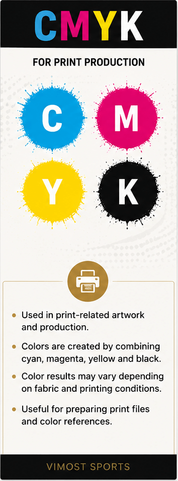
cmyk print color reference custom sportswear

CMYK is commonly used for print-related artwork. It can be helpful for preparing production files, but printed fabric colors may still vary depending on fabric and printing conditions.

RGB

rgb screen color reference custom sportswear

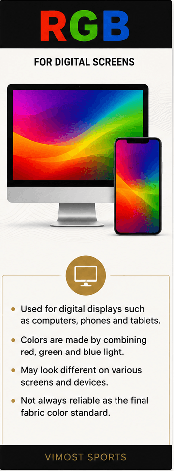
RGB is used for digital screens such as computers, phones and tablets. RGB colors are useful for online design previews, but they are not always reliable as final fabric color standards.

HEX

hex digital color reference custom sportswear

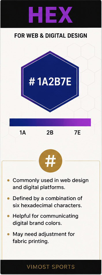
HEX color codes are commonly used for websites and digital design. They can help communicate digital brand colors, but they may need to be adjusted for fabric printing.

How Fabric and Printing Affect Color

The same color can look different on different fabrics. A smooth polyester fabric, mesh fabric, fleece fabric and textured fabric may reflect light differently and absorb dye differently.

For sublimated sportswear, fabric content and surface texture are especially important. White or light-colored polyester fabrics usually provide brighter color results. Dark base fabrics, heavy textures or special fabric finishes may affect color brightness and sharpness.

  • Smooth fabrics may show sharper artwork.
  • Textured fabrics may make colors look slightly different.
  • Mesh holes and fabric structure can affect visual brightness.
  • Fleece or brushed surfaces may look softer and less sharp.
  • Stretch fabrics may change the appearance of printed artwork when stretched.
  • White or light polyester fabrics usually provide better sublimation color results.

How to Prepare Color Information for Your Order

To help us understand your color requirements, please send as much color information as possible before artwork confirmation. This is especially important for brand programs, team uniforms, sponsor logos and repeat orders.

  • Team or brand color references
  • Pantone numbers if available
  • CMYK, RGB or HEX values if available
  • Vector logo files such as AI, EPS, PDF or CDR
  • Previous jersey or apparel photos if you want to match an old design
  • Design reference images
  • Priority colors that must be matched carefully
  • Any known color requirements from sponsors or brand guidelines

If you do not have Pantone numbers or brand color codes, you can still send reference images, previous samples or design ideas. Our team can help prepare artwork based on the information available.

Color Swatches and Sample Confirmation

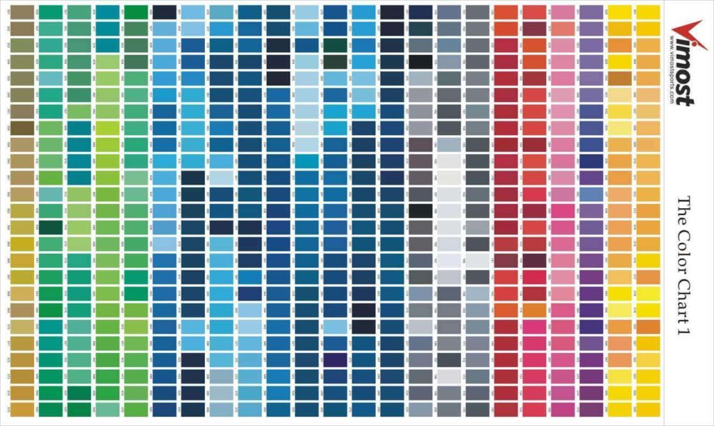
Digital color charts can help customers choose a general color direction, but they cannot fully represent the final printed color on fabric. For color-sensitive projects, physical swatches, printed samples or pre-production sample confirmation may be recommended.

Vimost Sports can discuss color references during the design and order confirmation process. If your project requires strict color control, please tell us before production starts.For strict brand color matching, please do not rely only on screen previews or digital color codes.

Important Color Notes

  • Digital colors are for reference only.
  • Colors may vary between screen, artwork preview and printed fabric.
  • Different fabrics may show the same color differently.
  • Sublimation colors work best on white or light polyester fabrics.
  • Pantone, CMYK, RGB and HEX values are helpful references, but they do not guarantee an exact match on every fabric.
  • For color-sensitive projects, sample confirmation is recommended before bulk production.
  • Please confirm all artwork and color details before production starts.

Color FAQ

Sublimation allows full-color designs, gradients and patterns, so customers can choose a wide range of colors. However, the final color result can be affected by fabric type, base color, artwork settings and printing conditions.

Screens use digital light to display color, while fabric uses printed dye or ink. Screen brightness, device settings, fabric texture, material and lighting can all affect how a color appears.

Pantone numbers are helpful if your team or brand has specific color requirements. They provide a clearer color reference for artwork communication, but fabric printing may still require sample confirmation for strict color matching.

We can use old jersey photos, samples or color references to help prepare a close match. For the best result, a physical sample or clear color reference is recommended.

Sublimation does not print white ink in the same way as some other printing methods. White areas usually come from the white or light-colored base fabric itself.

Yes. Fabric content, texture, base color and surface finish can affect color brightness, sharpness and appearance after printing.

For color-sensitive projects, sample confirmation may be recommended before bulk production. Please discuss your color requirements with our team before production starts.

Need Help Confirming Your Colors?

Send us your logo files, color references and design requirements. Our team can help review your color information before artwork confirmation and production.